Brand guidelines
Everything you need to use the Striimy brand correctly. Download our logos, explore the colors and typography, and follow a few simple rules so the brand stays consistent everywhere.
ZIP includes PNG (web + print) and vector PDF versions.
Logo
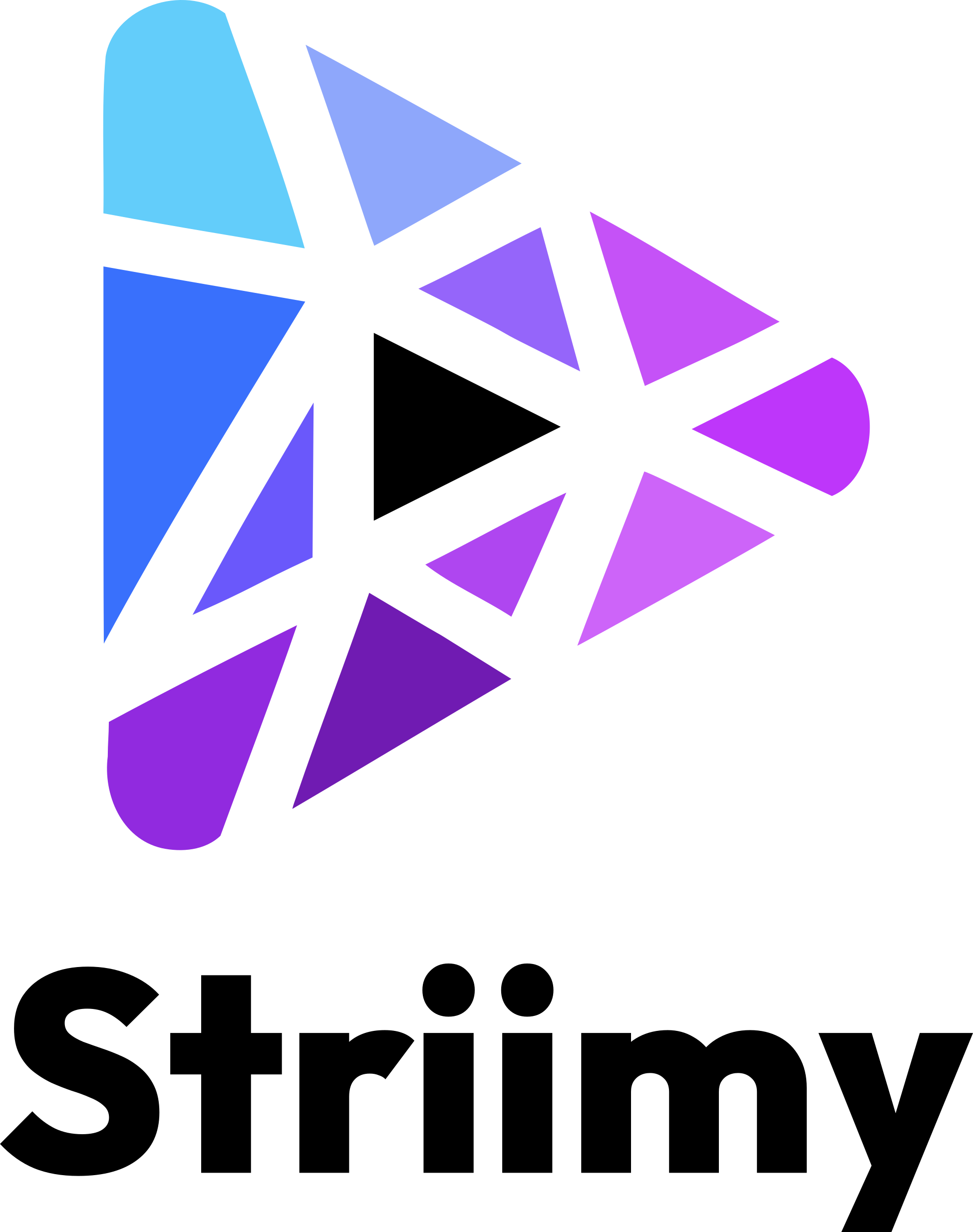
Our logo
The Striimy logo comes in three lockups. Choose the one that fits your space, and always use the version made for your background — light logos on dark backgrounds, dark logos on light backgrounds.
Horizontal logo
Our primary logo. Use it whenever there's room for the full lockup.
Vertical logo
Best for square or centered placements where there's vertical room.
Play icon
The standalone mark for avatars, app icons, and favicons — when the brand is already familiar.
Usage
Clear space & minimum size
Clear space
Keep clear space around the logo equal to at least the height of the play icon. Don't crowd it with text or other graphics.
Minimum size
Don't show the horizontal logo smaller than 24 px tall on screen (8 mm in print). Use the play icon alone when space is tight.
Colors
Color palette
Striimy's palette is built on an electric blue-to-purple gradient with a lime accent. Click any value to copy it.
Striimy Blue
Primary
rgb(59, 130, 246)
Striimy Purple
Secondary
rgb(124, 58, 237)
Striimy Lime
Accent
rgb(132, 204, 22)
Ink
Background · dark
rgb(10, 10, 15)
Off-white
Background · light
rgb(245, 245, 247)
Signature gradient
Our signature gradient runs 135° from blue to purple. Use it for highlights and accents — never behind the logo or body text.
Typography
Typography
We use two free typefaces from Google Fonts.
Headings & display
Outfit
Stream the game.
A geometric sans used in its boldest weights for a confident, sporty feel.
View on Google Fonts ↗Body & interface
DM Sans
Watch live padel, follow your league, and relive every point on demand.
Clean and highly legible for paragraphs, labels, and interface text.
View on Google Fonts ↗The “Striimy” wordmark is a fixed logotype — always use the supplied logo files rather than typing it out in a font.
Rules
Do & don't
Do
- Use the logo version made for your background.
- Keep enough clear space around the logo.
- Always scale the logo proportionally.
- Use the original supplied files.
Don't
- Don't recolor the logo or change its gradient.
- Don't stretch, distort, or rotate the logo.
- Don't add shadows, outlines, or other effects.
- Don't place the logo on busy or low-contrast backgrounds.
Questions?
Need another format (SVG, EPS) or unsure about usage? Get in touch and we'll help.
Email usmika@striimy.com